Featured Posts

BLOG BEING UPDATED - TRY AGAIN LATER This blog records the controversial era of British architecture, 1960's Brutalism. Many Brutalist buildings have been demolished and many still are under threat

Events

Brutalist event and exhibitions

The Architects

meet the architects behind the buildings

Buildings in danger

add to the list

Buildings

Brutalism in Britain

lol

Brutalism today

Does brutalism have a future?

Friday, 20 December 2013

Alexander Road Estate

Some pictures of the Alexander Road Estate, Camden, North London (I hope to do a further post later after some research). Completed in 1978 by Neave brown of Camden council's architecture department. Given grade two* listed status by English heritage. Part of the 'streets in the sky' movement, all cars are out of sight and pedestrians take priority. 


The main route through the estate


Tuesday, 24 September 2013

Recent Listing Updates 24/09/13

Preston bus station has been given listed status at grade 2 by culture minister Ed Vaizey. This will make it much more difficult (although not impossible) for it to be demolished under the current plans by Preston city council. 

Another brutalist icon has also been listed at grade 2*, a electricity substation on Sheffield. Also being listed was a concrete cold war bunker at Gravesend. Another building of some interest (although not brutalist) is Sir Norman Fosters relatively new but iconic high-tech warehouse in Swindon. 

EXHIBITION: Brutalist architecture in London

Following the brilliant exhibition at the new Wellington arch exhibition space at Hyde Park corner which celebrated the story of preservation during the 20th century of 19th century architecture by the likes of John Betjeman (Pride and Prejudice [now finished]) there now follows another exhibition this time the fight for the preservation of the 20th century architecture. 'Brutal and beautiful' - saving the 20th century will tell the less widely known story of the continuing fight for brutalist architecture right up to the present day and the battle to protect and educate people about brutalist architecture as John Betjeman and his contemporaries did for 19th century buildings.

25th September- 24th November 2013 
For details: 
http://www.english-heritage.org.uk/daysout/events/brutal-and-beautiful-wa-25-sep/

Friday, 21 June 2013

Harvey court

Harvey court on the west side of the Cam is one of many new buildings for colleges of Cambridge university. It was built for Gonville and Caius college, one of the largest and wealthiest colleges to house 100 university students. Its site is away from the traditional medieval quadrangles of the city (sitting on the opposite side of the Cam) and is situated in the area developed by the university in the 1960's. Its neighbours include the monumental Cambridge university Library (built in the 1930's), the   iconic History Department and the new faculty of law building by Foster and Partners.  Harvey court was built in Sir Leslie Martin's office by Colin St John Wilson and Patrick Hodgkinson and completed in 1962. The court was named after a fellow of the college William Harvey who was a medical pioneer in the seventeenth century.

The main courtyard is actually above ground level on the first floor (hence the steps from the garden with the area beneath used for utilities, storage and common rooms). The design of the building is a modern reinterpretation of the medieval Cambridge quadrangles with the rooms looking out onto the courtyard as they do in traditional courts. It is less conventional in the fact that the courtyard is paved rather than grassed and that it is not enclosed with only three sides facing the courtyard. The fourth side is detached from the main block and faces into a large pleasant garden. The gaps between the two blocks which are not directly joined is taken by stairs which link the garden to the square and the path from the street to square, the main entrance is also located here wedged between the two blocks. 

Each individual room has an outside terrace (except the first floor which goes directly into the courtyard) which is gained from building recessing after each floor. It has three tiers of student accommodation plus the floor below for utilities. When compared to some university accommodation they are luxurious, although the very generous windows could look out to a more pleasing vista as the courtyard is uninteresting and bland in design. 

The inner and the outer exteriors (facing the courtyard and the outside) are a contrast, the former with generous windows whilst the latter has very few and is much more brutalist in its character than the inner courtyard. From the street the building certainly looks brutal and oppressive (the recognisable trade marks of a brutalist building) but from the other side it is much more elegant and pleasing for those who do not favour the style. The stepped terrace gives the courtyard considerable light and makes it feel spacious despite being a rather small site. On the exterior the columns which surround the building on three sides create an arcade, perhaps also taking their inspiration from the medieval cloister walks and quadrangles of Cambridge. The facade is broken. The gradual recess of the upper floors which allows for a terrace is shown on the exterior by the stepped formation of the facade which as it steps back in the courtyard facade it steps forward and is jettied on the exterior facade. The stairs outline on the facade facing the road breaks up the minimalist nature of the building

The building uses bricks extensively through out and heavy glazing in the courtyard. It has been recently restored and modernised with new windows facing the courtyard and the addition of solar panels to the roof. En-suite bathrooms have also been added to each room which makes gives it similar standards to other student accommodation. The project of restoration cost £7.5 million and was completed in 2011 by Levitt Bernstein architects. 

The building was listed as grade 2* by English heritage in 1993 meaning that is protected by law and the recent restoration has meant it is fit for purpose again which saves it from any possible demolition threats.

The facade facing the road showing the stairwell (top left)  
and the columns which create the covered walk

Steps from the garden up to the courtyard


Friday, 12 April 2013

Elliot house

Norwich is one of Britain's most historic cities and much of its post-war architecture  has been relatively sympathetic to the character of the city. Elliot house on Ber street is one example of a relatively sympathetic building in a historic environment. It was built on the site of older medieval buildings (similar to those which survive) which survived the war but were subsequently demolished probably due to the increase in demand for office space in the city. Responsible for the design was the architect firm Edward skipper and associates, it was completed in 1975 as commercial premises. The building has four stories (including one cleverly hidden from the street in the roof) of which the recessed fourth story hides the buildings bulk and keeps the height of the street so it does not tower over existing buildings as many other brutalist buildings inevitably do. The building has large spacious windows overlooking the street and an internal courtyard which give the building plenty of natural light. Parking facilities are hidden in the basement with access via the sloping street on the side. 

The overhanging upper stories reflects its historic setting, imitating the sixteenth century house opposite. The subtly of the building is somewhat undermined by the over dominance of the lift shaft but it does have the effect of splitting up the building and making it look less overwhelming in the street. The lift shaft also creates a contrast with the rest of the building being of brick rather than concrete. It is this feature which is the most controversial aspect of the building, although part of the very nature of a brutalist buildings is that they are dominant and controversial. The building does keep the character of the area but also successfully creates a contrast between the old and new. The building is relatively sympathetic to the environment and much suitable than many other buildings may have been to the site.  

The building is unlisted, it is not of the highest architectural merit but it is its relationship with the rest of the street and its integration with the historic environment which makes it interesting and of merit. The building is currently vacant and is To Let for business premises, if not under immediate threat of demolition the prospect may very well arise to make the site more profitable if a tenant is not found. 


Sunday, 17 March 2013

Birmingham Central Library

Birmingham central library is a classic brutalist building designed by John Madin and opened in 1974 to replace the old Victorian central library. Despite its importance it will shortly be demolished as Birmingham's new library is completed in 2013. 

Before it is demolished I hope to visit and take a good look round but in the mean time here are some great pictures from a photography blog


Thursday, 28 February 2013

Liverpool Sugar Silo

When travelling along the dock road out of Liverpool there is a surprising structure of concrete which dominates the corner of Bankfield street and Derby road. It surely makes one of the must unusual and unique dock buildings in Liverpool, a city with a rich selection of dock buildings of all ages.  The building was built in 1955-57 by the Tate and Lyle's engineering department to store sugar as it came in to the port of Liverpool. The building is of a very simplistic design as was the fashion of the 1950's with a single chamber tunnel vault with entrance and windows at both ends. It has a very elegant form, although the corrugated iron addition to the top of the building detracts from this elegance. The building was listed at grade 2* in 1992 by English Heritage as good example of reinforced concrete parabolic tunnel vaulted storage unit.

The building no longer serves its original purpose of storing sugar as more modern form of storage have been adopted. For many years it was used as a lorry park for lorries in the docks. More recently the building stands redundant and at risk. It is a hard building to covert to a new purpose due to the expanse of space and the lack of windows, which are only on the two ends of the building. However I could imagine the building be put to a good and effective new use, a new concert venue or exhibition hall perhaps? 

The building could be considered a modern day equivalent to the Victorian Tobacco warehouse of Stanley dock (also on the dock road), due to its scale and purpose for one product storage. By comparison this building too is hard to find a new use due to its size and lack of light. Although there are no issues with 2 meter high floors in the Sugar silo, an issue long made the tobacco warehouse unsuitable for conversion. 

The building has appeared in many books and publications including 1001 buildings you must see before you die Mark Irving, which perhaps suggests it is appreciated by many people who believe like English Heritage it is an important building worthy of preservation.  


Friday, 22 February 2013

Kingsway tunnel ventilation shafts

 The Kingsway tunnel ventilation shafts are two identical structures on the opposite sides of the Mersey which provide ventilation for the Kingsway road tunnel. They were completed in 1971 when the Kingsway tunnel was completed between Liverpool and Wallasey. The two towers dominate the riverfront of north Liverpool and Wallasey sited on the dock road and on the Wallasey promenade respectively. The buildings have a simple composition with a central tower/chimney with two air intakes on each side. The buildings are very utilitarian, being  strictly functional with striped back decoration. The buildings are mostly concrete with exposed concrete on the tower (or chimney) and white coloured concreted for the two air intakers. The base is built with a dark brick. Although the buildings may look very simple they actually have subtle curves on the tower and air intakers which are much more pleasing than straight edges. 

The towers were built by the civil engineering firm who built the Kingsway tunnel directly below each structure, Edmund Nuttall Limited (now known as BAM Nuttall Limited). The fact that they were built by engineers rather than architects means that the buildings cannot be contributed to a single architect or even set of architects, just to a anonymous set of engineers therefore there is not a name associated with the buildings other than that of the engineers. The two towers are unlisted  but unlikely to be threatened with demolition as they still carry out there original purpose and replacing them would be very expensive. 


Also on the Mersey are a set of earlier ventilation shafts completed in 1934 for the Queensway tunnel, the original road tunnel across the Mersey. These are a stark contrast to the Brutalist towers of the 1970's, those on the Liverpool front are faced in stone whilst those on the Birkenhead front are faced in a dark brick. The fact that the two new towers are similar and not completely different like the previous towers of the 1930's  demonstrates to my mind a more egalitarian partnership between the two sides of the river as they are treated equally (instead of the expensive stone for prosperous Liverpool and cheap brick for the less affluent birkenhead side). 


Saturday, 19 January 2013

SAVE Preston Bus station

The fight is on to save the historic Bus station in the heart of Preston (see previous post). To aid the campaign in saving this, one of the most important Brutalist works in the country sign the parliamentary petition to save it and write to the council voicing your concerns. Also make sure you share and draw attention to this buildings plight. 

We need as many signitures as possible- at http://epetitions.direct.gov.uk/petitions/43236

Friday, 11 January 2013

Preston Bus station


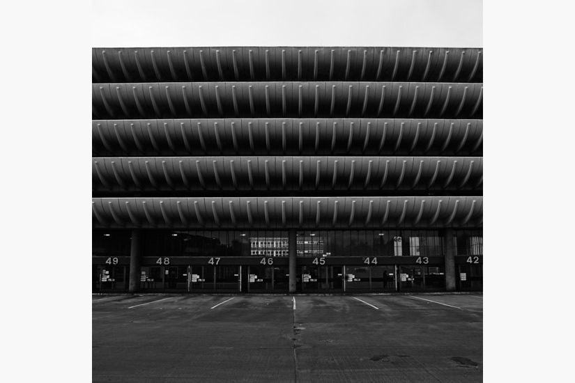
Preston Bus station was built in 1969 by architects Keith Ingham and Charles Wilson of the Building Design Partnership. It was publicly funded by Preston council and occupies a large rectangular site in the city centre. It houses the bus station in a grand double height area on the ground floor and over 1,000 car parking spaces above. When it was opened in 1969 it was the largest bus station in EuropeIt has always been a controversial building especially in recent years with some considering it a 'eyesore' whilst others consider it a brutalist masterpiece. Its heavy use of concrete sits it comfortably in the brutalist school of architecture however the elegant curves of the balconies soften its brutalist image. In my view it is one of the most elegant post-war buildings in the country.  

The building from the outside is distinguished by the sweeping four tiered (five tiered at the rear) concrete jettied balconies which house the car park above the bus station. Even someone who despises brutalist architecture cannot fail to be impressed by the vastness of the space which the building occupies. I think the design would be much diminished if a straight concrete wall had been adopted like originally planned.The ground floor on both sides is used as docking area for the buses with 80 individual stands. 

Inside the building retains many original features, mostly due to its neglect and lack of modernisation over the years. However as quality materials were used in the building they have lasted well over 40 years. Of particular note in the interior is the flooring, which is Pirelli used in formula 1 tyres, the woodwork which is the African hardwood Iroko and finally the iconic white tiling used through-out the building from Shaws of Darwen. The building is accessed by three subways or via an entrance on the front facade. The interior of the building consists of two long open halls where passengers stand (separated by characterful African wood barriers) and wait for their bus. The two halls are separated by facilities including: toilets, a cafe (with authentic 1970's bright green chairs), information and ticket areas and offices for staff above, Also between the two waiting halls at either end are some small shops allowing one to have a haircut whilst one waits for their bus. Another distinguishing feature of the interior in my view are the original clocks which before the large and unsympathetic signs were put in (out of shot on picture above) dominated the view down the building (see above). Above the bus terminal is four/five stories of car parking which are less distinguished compared with the bus terminal and are not unlikely many other car parks of the era. The stairwells (of which there are four) give access through-out the building and continue the use of white tiling although unfortunately like many other car park stairwells the stench of urine is overwhelming. The 20th century society describes the bus station as one of the most significant Brutalist buildings in the UK.


It has been put forward twice for listing by the 20th century society and English heritage but refused both times. Its lack of legal protection leaves it vulnerable to unsympathetic alteration and demolition. It was first proposed for demolition in 2000 but was fortunately saved when the £700m Tithbarn shopping development collapsed in 2011. However plans for demolition have re-surfaced recently and after a vote was carried by Preston council on the 7th of December 2012 it was decided to demolish the bus station. The main (flawed) argument for demolition is due to the high costs of modernising and maintaining the building. Demolition which could cost £1.8 million could soon begin even though there are no plans for its replacement and the site is earmarked for a bleak open car park which will undoubtedly give the area a more negative image. This seems vaguely reminiscent of the 1960's when fine Victorian buildings were leveled as they were out of fashion and yet the sites laid empty for years sometimes decades. Another argument used has been that it is in the wrong area of the city which is no reason to demolition a perfectly good building, it is a very wasteful approach. 


Public opinion is split on whether to remain or demolish this powerful brutalist statement which is no doubt the most recognisable building in the city. Although opinion is split it was recently voted the most popular building in Preston by residents. The future does not look bright for this 43 year old icon of the city, but there may still be time for the building to be saved. The building is enormously importance for the image of the city of Preston which is full of other examples of Brutalist architecture such as the guildhall and market. It is by far the best example of Brutalism in the city if not one of the best in the country. It also has high value for the tourist industry, it is internationally known building and features in global books of architecture and is one of the 1001 buildings to see before you die (mark Irving). The loss will be a disaster for the city and its reputation by the arrogant Councillors who do not appreciate its architectural importance.   

The bus station is such a unique and unusual building I feel that there must be an alternative to demolition, surely it can be modernised for its current use or adapted for a new one? Someone I encountered when visiting the building suggested a public roof garden, which is an idea I really like. It is this type of creative thinking which the building needs so it can be adapted for a new use. A roof garden would be amazing as the building has a splendid panorama view of the city, It could be enriched by a roof terrace cafe and be a major tourist attraction. If the bus station was to be made redundant shops could be inserted into the docking areas, the car park could be retained as there is still a high demand for parking in Preston, just an idea? If architects sat down and thought about adapting the building I'm confident a new suitable purpose could be found. It is a shame that Preston council are so narrow minded!

April update- Another application for listing has been presented supported by English heritage and RIBA. However an application has been made by Preston council to block attempts at listing the bus station. The future of this iconic building is still hanging in the balance

To help save this building sign the petition (left on the links bar), write to the council in protest or tweet to bring attention to the plight of this building!